There are many ways to compose an illustration, whether it be a scene with many focal points or just one focal point, as with a single character. It can be done on canvas or on the computer, it all depends on which you prefer or have at your disposal. I'm going to use the computer, since it happens to be the less messy of the two, by using Photoshop as my desired art program.
If you are unfamiliar with this program, tutorials are always a great way to learn the ins and outs of its operation. I don't think I could have made it through college without them!
Your composition should always be well contrasted, given a more abstract perspective (unless you're drawing concept art), and as close to what you envision it to look like as possible. If you are ever unsure of your sketch, check these elements:
- Line. The strokes in your composition.
- Form. The correct proportions of the drawing.
- Contrast. The relative difference between light and dark in the composition.
- Balance. The harmony of the line, form, and balance in the composition.
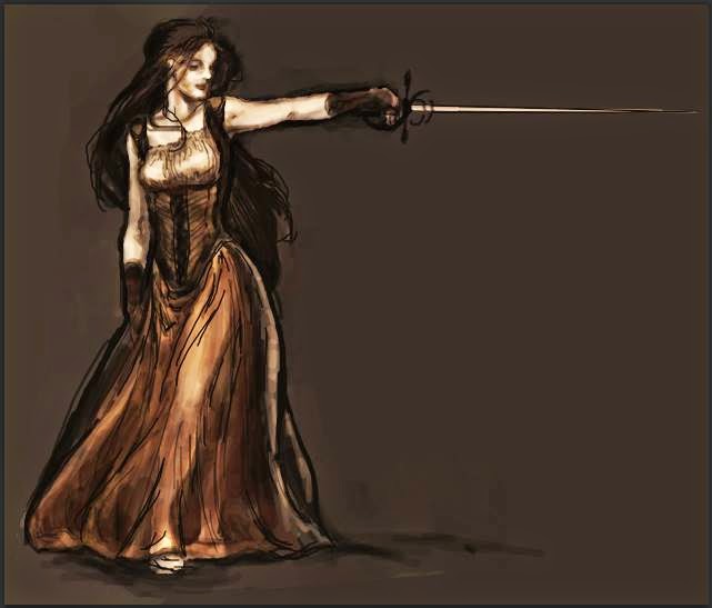
I'll be creating a character since it is easy to compose and explain. This is what it will look like finished.
The process
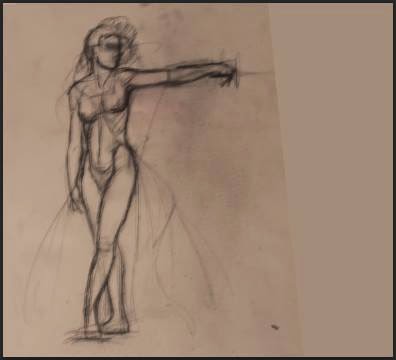
1) Draw a diagram of the character, then scan it in. I suggest you keep your drawing as simple as possible. The details should only happen after you have laid down local (primary colors of your composition) and have proportioned it correctly. When you have uploaded your drawing into Photoshop, begin to brighten it up by selecting the "Brightness and Contrast" widget. Now, lay down a background.
Important: always make sure you are using "layers" for each step in this process.
2) Add contrast and form to the character's dress and anatomy by laying down plain-colored, medium toned strokes. Again, don't add detail, there is still a ways to go before the character begins to have, well, character.
3) Begin to refine your strokes and continue to build. This is where you will most likely be forming and proportioning each tuck/fold of the gown on the structure of the body.
Important: It is vital to be bold with your strokes and constant with the contrasted areas throughout the drawing.
4) Add a bit of color, this is where you will notice that your character will begin to look "alive." If you want him/her to be in a cooler environment it is always best to tend towards the cooler colors of the color wheel or vice-versa. I want her environment to be lukewarm, so I'll tend more towards the colors in the middle of the wheel. Her skin will stay a creamy, pale tint.

6) This is where you will be focusing most of your attention to the detail. You should zoom in fairly close so that every aspect will draw the eye. If you look at the hilt of the rapier, you will notice it has an allusion of a shimmery, metal texture. this is done by focusing/building on the light tints of the blade and other parts of the weapon that you would consider your light sours to bounce off.
Important: Concentrate the lighter colors where light will most likely be and the darker in the recessed, shadowed areas of the garment and character.


0 Comments:
Post a Comment